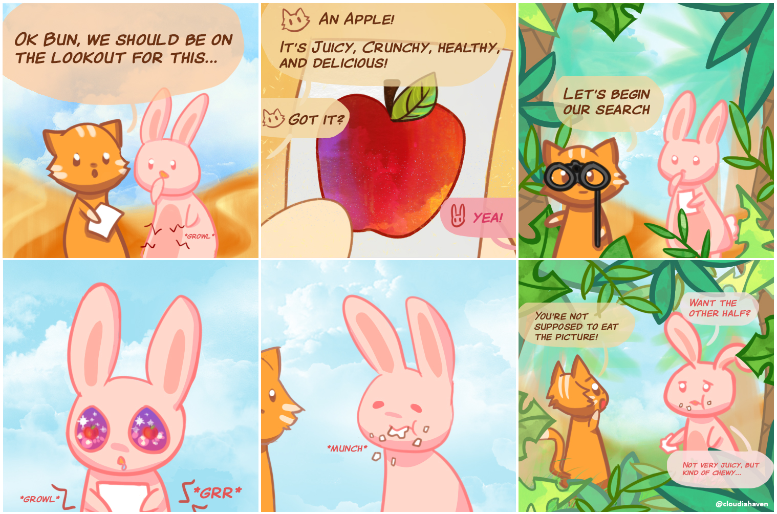
As I was listening to an Ajahn Brahm talk, I was inspired to draw my first colourful comic featuring a cat and a bunny.

This short story about the bunny (now named as Bun) eating the picture instead of the apple. It’s the zen story/lesson/analogy pointing to the moon, and thinking the finger is the moon.
I wanted to make my own little spin off featuring these two cute animals. Maybe the story doesn’t quite hold the same meaning, but it was a nice inspiration. I want to take the adventures of the two and make it into a wholesome, bright, and cheerful comic.

Concept images for what they were to look like. 
Here was my initial design for the cat and the bunny.
As I was drawing the cat and the bunny similarly to the style I had made in the concept, I didn’t really like how it ended up looking. It looked too simple and also not as cute as I would have liked. So I eventually settled on a more “fluffy” style for the orange cat while the bunny stayed similar.
The next comic I wanted to base it off of the zen story of emptying the cup.
A university professor went to visit a famous Zen master. While the master quietly served tea, the professor talked about Zen. The master poured the visitor’s cup to the brim, and then kept pouring. The professor watched the overflowing cup until he could no longer restrain himself. “It’s full! No more will go in!” the professor blurted. “This is you,” the master replied, “How can I show you Zen unless you first empty your cup.”
http://truecenterpublishing.com/zenstory/emptycup.html
The struggle was trying to capture the meaning in relation to the adventure of the cat and the bunny.

Although I don’t think I fully captured the Zen meaning, it was still a nice inspiration for me in creating this comic. The goal I had in mind for this second comic was to practice landscape/scenery. While it isn’t very detailed scenery, I had a lot of fun experimenting with brushes, colours, and also capturing the essence of a mountain or forest in a minimal style. I also used a more “abstract” style for the background and only outlined the main subjects (the animals and the basket of fruit).
I finally decided to name the cute animals (besides calling them Cat and Bunny), Kit (the cat) and Bani (the bunny). They’re basically “cat” and “bunny still, but it looks like a name now x). Kit was inspired not by Kit Harrington (Jon snuuu), but rather Kit from a Sims 4 Lets Play by Deligracy. I loved that character and her story and I really liked the name! Bani is the name inspired by someone I occasionally play Tower Unite with whole happens to like bunnies!
Some progress pictures:
Panel 1 progress. I eventually replaced the hand-drawn grass with broader brush strokes and a grass brush for texture.


This used to be the old panel two for the bunny picking oranges. My goal was to represent the afternoon sun (as Bani progresses through the day from morning until night), however the panel was too bright, especially in relation to the other panels.

For a good viewing experience, I think it would be nice if the colours gradually transitioned from the bright hues of a sunny morning to the dark cozy night time to show the passage of time, and to give a good flow between panels.
I want to keep the second panel bright to represent the afternoon sun, but I also wanted the colours to lead into the dusky colours in the third panel. Either I change panel 2, or panel 3.

I think I mostly solved the issue by redrawing panel 2. Instead of focusing on the bright sun, the sun is further away but still very present. The panel is still vibrant, but the emphasis on the sky is lessened by the addition of mountains and more trees. The blue sky and the sun bursting from behind the leaves is no longer the overpowering feature.


